Spring Color Forecast…Applied!
We thought it would be fun to check some of the major paint retailers for inspiration and see what’s new for Spring ’09. At Mochi Home, of course, that means more than just regurgitating some color palettes and swatches. We want to see what a room would actually look like with these colors and ideas applied. Luckily, our friend Clarence (of Streetfilms fame) sent us some pics of his cozy little pad. He wanted to see what we could come up with; so here it is. We hope you like it, Clarence!
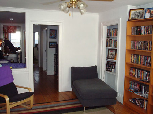
Here’s the apartment as it is. You can see it’s been renovated with nice clean walls and windows to move light throughout the apartment. The fabulous (and original) wood floors are still intact, which helps retain it’s charming Brooklyn character.

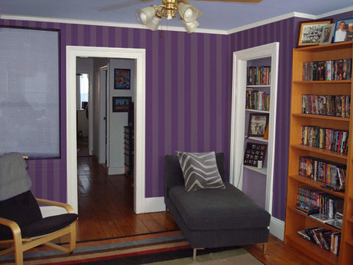
Conscious Luxury from Sherwin-Williams.
We have to start with the purple room. We picked up this color palette from Sherwin-Williams. They call it Conscious Luxury from the 2009 Lifestyle Collection. The palette is a bit feminine, so we pulled out the bolder shades for a more modern and manly luxury. Check out the stripes, for a wallpaper effect. We also added a graphic pillow from West Elm.

Historic Milk Paint
Next, we tried something more soft and subtle from The Old Fashioned Milk Paint Company in Groton, Massachusetts. We love this paint because it is produced using historic methods, is free of harmful chemicals, non-toxic, eco-friendly and just plain pretty. We used Lexington green in different shades for the walls and accented the bookcase with Federal blue. Lastly, a few more West Elm accessories and a neat Chilewich roller shade complete the look.


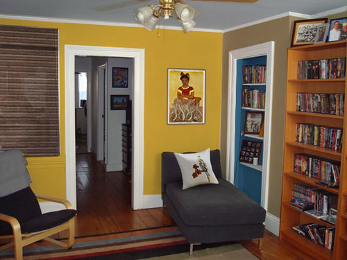
RL Island Brights
If that was too understated, then Ralph Lauren paints have the antidote. One of our all-time favorite color palettes is the Island Brights collection featuring some juicy shades of tropical paradise. For Clarence, we picked the very appropriate Bicycle Yellow for the main wall and added Island Sand and Montego Bay blue as compliments. We added a colorful Diego Rivera print and the existing striped rug also goes great with this theme.
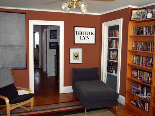
Modern Classic from Ben Moore
Lastly, a little “grown-up” bachelor pad inspired by Benjamin Moore’s Modern Classic scheme. Sedona Clay and Hale Navy look both fresh and classic with the existing simple furniture and that striped rug. We also like how the Sedona Clay wall blends in with the huge wooden bookshelf, almost giving the effect of a built-in bookcase.
We like all of the rooms and can’t decide on a favorite. But you can see how a coat of paint can transform an already nice room into something really spectacular.
Check out these similar posts:


Blue and orange in the Benjamin Moore color scheme – so Howard Johnson’s yet it translates into a great room, very dynamic. If the blue were made more navy, what could you do with the orange? Would it still match?
Awesome work!! that is such a fabulous tool! When can you come try some paints in my apartment?
😉
Pingback: North Facing Room: The Best Most Popular Benjamin Moore Paint Colours