Common areas and building exteriors are perhaps the most important living spaces. And yet, they often get the least attention. According to the principles of Feng Shui (and common sense!), you can set your mood and perhaps even your luck just by creating a welcoming entrance. For condo owners, that entrance starts with the lobby.
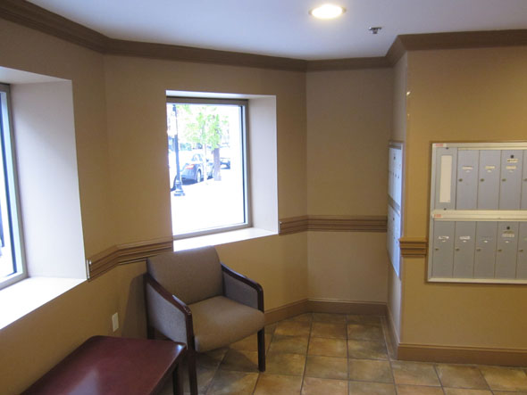
Here is a lobby that is neither old nor new, but looks a tad tired. It does have clean lines, clean (as in not dirty) floor tiles and whole lot of potential.
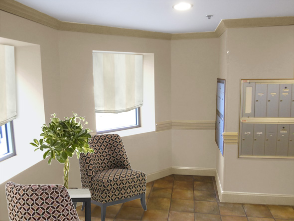
I don’t hate the wall color. In fact, it’s pretty tasteful. However, it’s also almost the same color as the floor and creates too much of a monotone dark effect. The obvious fix is to lighten things up! Check out this tasteful beige. Wall coverings make this bland lobby instantly welcoming and plush patterned chairs create a nice contrast to the beige.
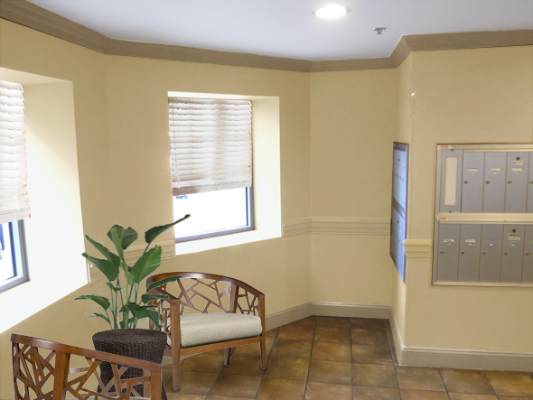
Here’s a slightly warmer beige. Notice that the chair rail molding is painting the same color as the wall. This minimizes the bulkiness of the molding, but it also creates a subtle architectural effect with shadow and highlight. I love the look of single-color wall and molding. These cool chairs from Crate and Barrel and woven side table give this lobby a global-artsy vibe.
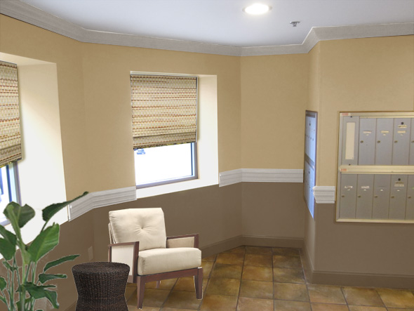
Lastly, rather than minimize the chair rail, what if we emphasize it? Dark brown on the bottom really grounds this space and an ivory chair “pops” against it. Woven shades keep the room cozy and add texture, without overwhelming the space.
As you can see, even an OK lobby can benefit from a little attention to detail. With some window coverings and an easy furniture upgrade, this room goes from overlooked common area to an extension of your home.


3 responses to “Common Area to Fabulous Area”
Wow, great advice!! I came across your blog from InStyle Best of the Web and will definitely be bookmarking it. I will be sending in my bedroom to be “Mochi-fied” soon. Keep up the good work 🙂
Love the Crate and Barrel chairs, but with the two-toned color scheme and textured blinds. What did the owners choose? Will you post the remodeled lobby when it’s done?
amazing transformation
http://pinklemonincrystal.blogspot.com
twitter @divalicious_m