We have two issues to address in this living room. First, is the issue that our reader submitted: how to paint a great room which includes the living area, the dining room and the kitchen. How can you differentiate spaces when each functional area shares so many walls and so much air space? The second issue, which I noticed, is that this room suffers from a serious overdose of brown. Some carefully placed wall color and area rugs can help keep the spaces from blending together too much (and can also break up the monotonous brown!)
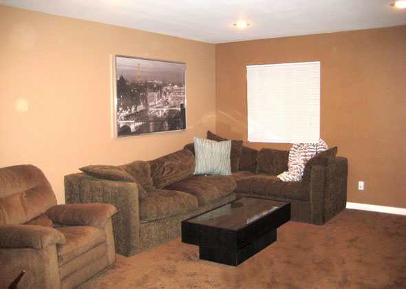
Here is the current room. What you can’t see here is that the dining area is next to this seating area, which then blends straight into the kitchen. It’s a quintessential “great room,” but without architectural features, there is little to articulate the functional areas.
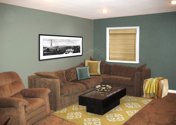
In every scenario, I’ve painted the two walls different colors. When you are faced with one huge room, a simple solution is to create an accent wall. Pick any wall or area of the room you want to draw attention too. Check out this teal color, which coordinates nicely with the existing brown. Some golden yellow touches give the color palette a little edge and global accessories timeless. Also note that I added molding to the window and updated the blinds to make it look more substantial. Here’s the updated room recap:
- Benjamin Moore paint in Wedgewood Gray and Aegean Teal
- Andalusia rug from West Elm
- Etched Square pillows from West Elm
- Woven wood shade from the Shade Store
- Cowhide cocktail ottoman from Room and Board
- Rafia bowl made in Uganda from Ten Thousand Villages
- Black and white photograph of Paris from Allposters.com
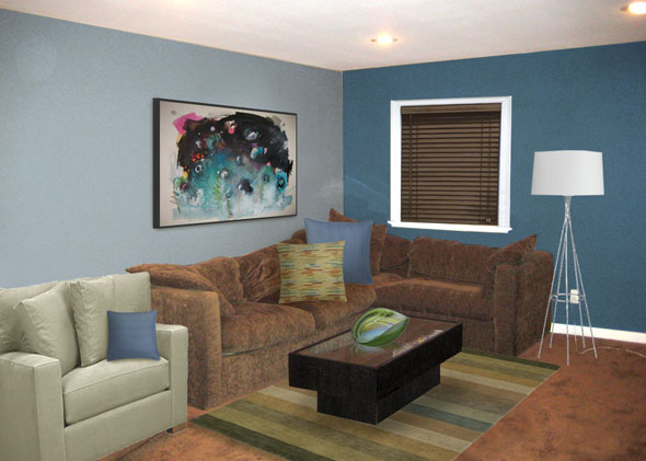
Next up, some modern blues. I replaced the brown recliner with a more modern chair in a contrasting beige. I also darkened up the window shade. My favorite addition is the art to make an interesting focal point behind the couch. That particular piece is total steal – original art by Seon-Jeong Kim sold on Etsy. Room recap:
- Benjamin Moore paint in Lucerne and Serenata
- Axis chair from Crate and Barrel
- Seaglass Stripe rug from Crate and Barrel
- Jenga pillow
- 2″ wooden blind from the Shade Store
- Original modern art sold on Etsy
- Agave bowl
- Twine floor lamp from CB2
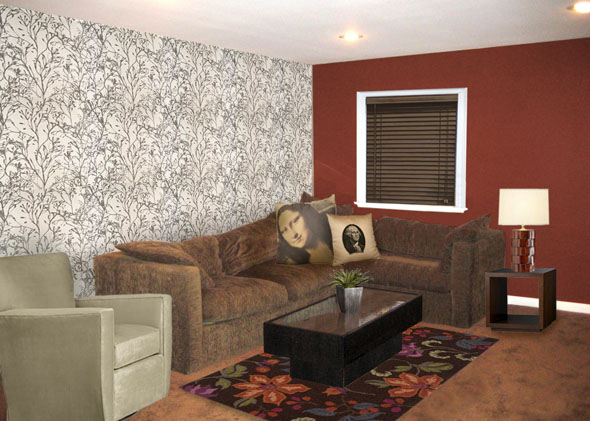
Lastly, an accent wall is excellent place to make use of wallpaper. I find that an all-over wallpaper is too busy for my taste. On a single wall, however, it adds a lot of depth and life to a room. This totally adorable wallpaper comes from Denmark. Room recap:
- Wild Flower wallpaper from Ferm Living
- Benjamin Moore paint in Caliente
- Yasmine rug from Crate and Barrel
- Mona Lisa and George Washington pillows from Atelier Expo Arte sold on Etsy
- Neo bunching cube, Gentry table lamp and Streeter swivel chair from Crate and Barrel
There are a lot of ways to define spaces within in larger room. Don’t be afraid to use more than one color of paint or to experiment with wallpaper and area rugs. A big great can be just that…great!


2 responses to “Putting the “Great” in a Basic Brown Great Room”
Hi! Would you mind if I share your blog with my zynga group?
There’s a lot of folks that I think would really appreciate
your content. Please let me know. Thank you
Look at my web site nordvpn coupons inspiresensation (t.co)
nordvpn 350fairfax
WOW just what I was searching for. Came here by searching for nordvpn Coupon special coupon code 2024