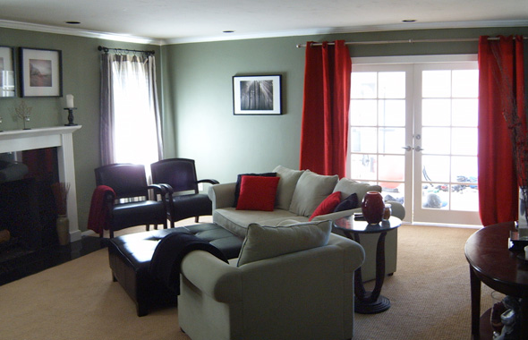
Sometimes decorating is like losing weight–those last ten pounds (or last 10%) are always the hardest! That’s certainly the case with the living room below. When our reader sent this photo, my first reaction was, “This place looks fabulous!” Notice how well coordinated the furniture, paint color and accessories are. The theme is carried out in full, right down to the smallest detail. By most standards, this living room is in pretty great shape.
However, our reader didn’t quite see it that way. She is struggling with the color palette, and specifically the accent color. While the red provides a nice contrast to the otherwise neutral theme, the red combined with the green gives off too much of a Christmas vibe. I like the red, but I can also see our reader’s point. Let’s see if we can give her some ideas for new and even unexpected accent colors.

The current room:
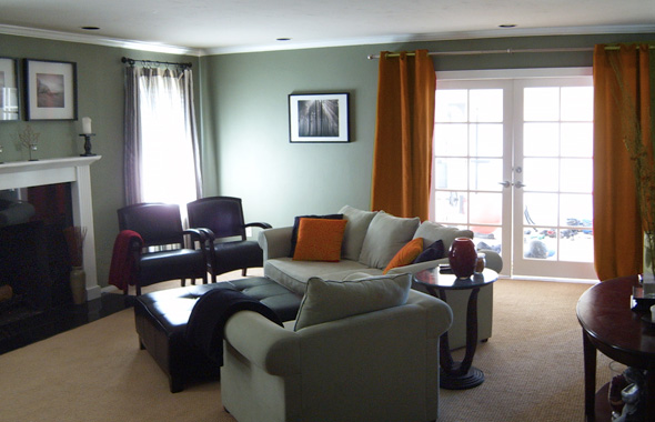
![]() My first inclination is just to shift the red to a more orange-y color. This eliminates the “Christmas,” but keeps the contrast.
My first inclination is just to shift the red to a more orange-y color. This eliminates the “Christmas,” but keeps the contrast.
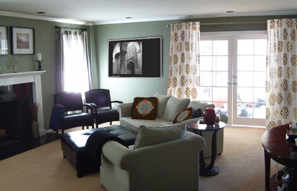
![]() Another variation on the orange/earthy scheme is to introduce pattern. Here’s a Moroccan inspired palette with accent pillows from Etsy and Medallion curtains from West Elm. I also think the room could benefit from one larger (and more dramatic) piece of art. In this version, I placed a black and white photo of Morocco.
Another variation on the orange/earthy scheme is to introduce pattern. Here’s a Moroccan inspired palette with accent pillows from Etsy and Medallion curtains from West Elm. I also think the room could benefit from one larger (and more dramatic) piece of art. In this version, I placed a black and white photo of Morocco.
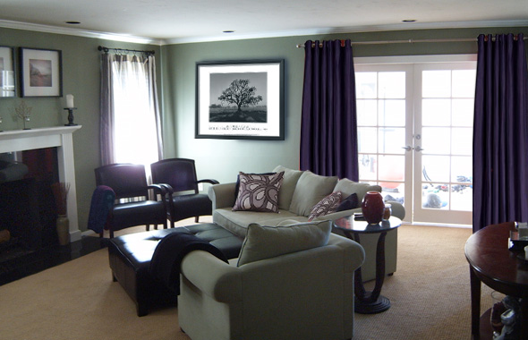
![]() Our reader was interested in exploring blue accent colors. With the sage green, it’s tough to find just the right shade of blue. Here, I opted for a rather purple-ish dark blue. This includes curtains in lustre sheen/Elderberry and art deco glam pillows. The overall look is very sophisticated.
Our reader was interested in exploring blue accent colors. With the sage green, it’s tough to find just the right shade of blue. Here, I opted for a rather purple-ish dark blue. This includes curtains in lustre sheen/Elderberry and art deco glam pillows. The overall look is very sophisticated.
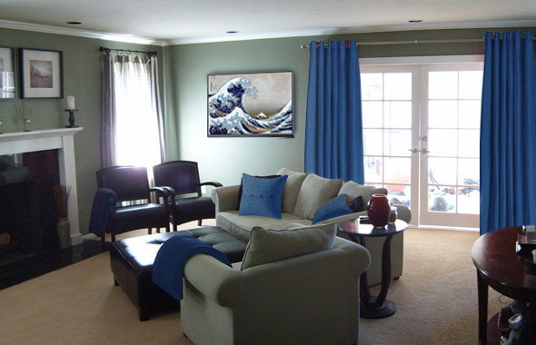
![]() To brighten up the color palette, here is a royal blue. I wouldn’t immediately think to pair sage green with royal blue, but with the right accessories and artwork, it is possible to tie it together. In this scenario, the Japanese print ties together a range of sea greens, ocean blues and misty atmospheric neutrals. With art like this, you can make it work.
To brighten up the color palette, here is a royal blue. I wouldn’t immediately think to pair sage green with royal blue, but with the right accessories and artwork, it is possible to tie it together. In this scenario, the Japanese print ties together a range of sea greens, ocean blues and misty atmospheric neutrals. With art like this, you can make it work.
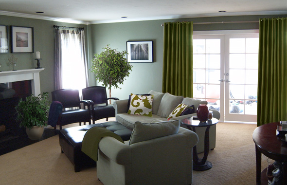
![]() Lastly, when in doubt, keep it in the family. In this case, the green family. Sometimes you can make a pretty and unexpected palette by sticking to a particular hue. In this room, the sage green acts like a beige – in other words it becomes the neutral backdrop to the saturated green. The key, again, is in the accessories. What better accessory to a green palette than some actual live plants? Silk dupioni curtains in Greenhouse add a lush green anchor further matched by graphic pillows.
Lastly, when in doubt, keep it in the family. In this case, the green family. Sometimes you can make a pretty and unexpected palette by sticking to a particular hue. In this room, the sage green acts like a beige – in other words it becomes the neutral backdrop to the saturated green. The key, again, is in the accessories. What better accessory to a green palette than some actual live plants? Silk dupioni curtains in Greenhouse add a lush green anchor further matched by graphic pillows.
I hope this gives some new ideas for a lively color pallette with sage green. This room is so close…just that last 10% and it will surely be complete!
4 responses to “Choosing an Accent Color”
Lots of great ideas here! So right about the blue, but I am liking the purple…maybe with the plants?!? Nice work overall. Thanks!
I think purple could work. You can also imagine a navy blue or deep purple/blue would also look nice. And certainly any of the options would look great with plants. If I add one living thing to a room, it always warms up the decor.
Good luck and send us some photos of the finished room!
Lot of thinks lot of idea, i live very much deep blue
I would love to find those Art Deco pillows in the purple-sage room. West Elm does not appear to have them. Ideas?