Last month I attended the Apartment Therapy Offline Design Meetup. The theme of the meetup was group design therapy and together we helped fellow New Yorkers find a cure to their apartment woes. You can read all about one apartment here. It was so much fun to brainstorm as a group and I got lots of ideas for my own apartment. Mostly, I was impressed by how friendly and open-minded these design enthusiasts and Apartment Therapy readers are.
One reader asked me for some help visualizing her ideas and the ideas from the design meetup. She and her husband are renovating their apartment to accommodate both a home office for two people and a new baby! Below, are some visualizations, which hopefully help them narrow down their options.
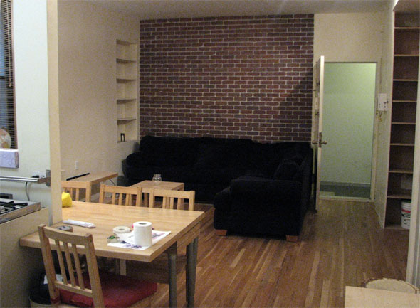
Here is their existing apartment:
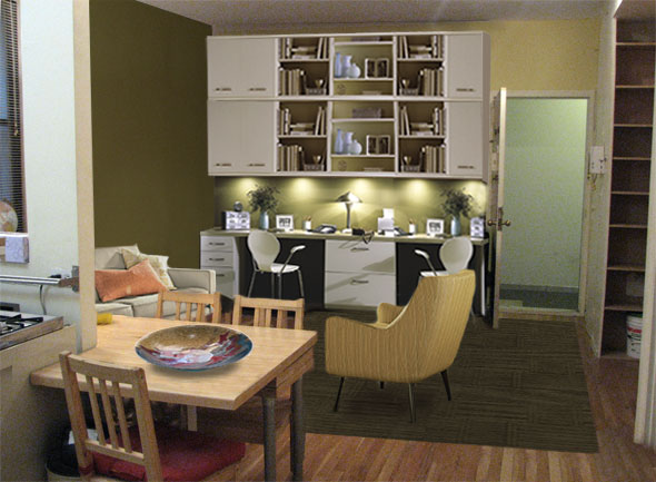
The first thing you’ll notice below is the floor-to-ceiling built-in home office where the exposed brick used to be. Their plan was to turn that corner into the office. I tried this built-in as a suggestion, which included shelves and some nice lighting. With this in place, I added some earthy accents which include walls in olive green and celery. Next, I threw down a complimentary rug from Flor in the Fret Knot pattern. Flor rugs are really practical (especially for kids!) as you can clean or replace individual tiles and the rubber backing makes them slip resistant.
As for furniture, there are some pieces with clean lines, but a welcoming spirit including the Quinn chair and Reese couch from Room and Board. I always love to finish off a room with some hand made accessories from Etsy. This chunky and colorful bowl from finishes off the look.
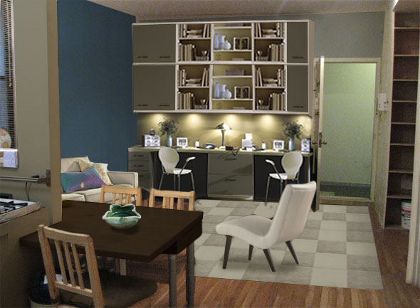
Keeping the same base, here is blue version of the living room. I darkened the cabinets of the home office, added a blue wall and brought in some darker woods to compliment. To keep the room from getting too dark, however, notice the light cream Delta chair with the white checkerboard Flor rug. I love how this rug makes the room look so fresh! Lastly, this interesting Petal bowl brings the blues into the dining area.
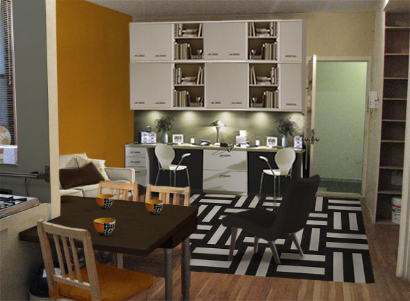
I love this bold palette of orange-yellow, black and white. The orange wall really pops and give some fun personality to the room. The wall is particularly striking with the geometric Flor rug. In this scheme it’s best to keep furniture and other accessories to a minimum or the small space will be overwhelming. A simple black chair, white cabinets and a grey kitchen keep the focus on the rug and wall. And of course, I couldn’t resist these adorable bowls.
Lastly, a soothing combination of warm gray and jewel-tone teal. Here, the color is actually on the cabinet doors and the main wall recedes as a backdrop. Instead of a huge rug, there is a plush brown ottoman, which can serve as a footrest, a table, extra seating or even a play object for kids. Ottomans are great multi-taskers and a good option for flexible multi-use spaces. I did add a small mat at the front door for wiping your feet and finished the room with a lovely original watercolor.
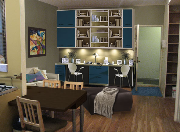
This apartment has great potential as functional space packed with uses and stylish space for a young family to call home. We wish them best of luck with their renovations and new additions!
4 responses to “A Splash of Color and a New Home Office”
I absolutely love your website. you have some cool design ideas. i am getting ready to decorate my room and i am a bit confused. i have mocha color furniture and i found red/warm spice color curtains to go with it. i am wondering which paint colors would go great with it? please help if you can. thank you.
[…] in Lagoon and Twill Ride in Silver/White. I also spiced up this living room and this West Village apartment with some […]
Definitely imagine that which you stated.
Your favorite reason seemed to be on the net the simplest thing to be
mindful of. I say to you, I certainly get annoyed whilst
other folks consider worries that they plainly do not recognize about.
You controlled to hit the nail upon the top and also defined out
the entire thing with no need side effect , people can take a signal.
Will probably be again to get more. Thanks
my homepage nordvpn coupons inspiresensation
Great info. Lucky me I discovered your site by chance (stumbleupon).
I have book marked it for later!
my blog … eharmony special coupon code 2025