No matter what the size, a kitchen update is always a big deal. It not only makes cooking more fun, it instantly adds value to your home. And while cabinets and appliances are the big-impact pieces, it’s important not to neglect the walls or the accessories.
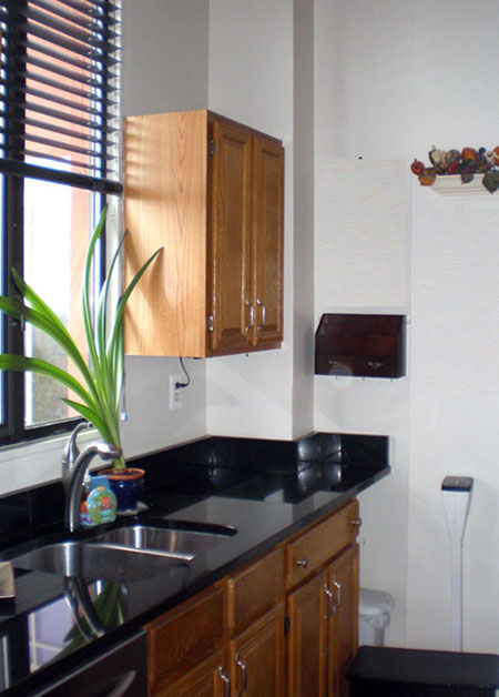
This reader is in the process of updating her kitchen from a more traditional oak to something more modern. As part of a DIY renovation, she has already painted the lower cabinets black and swapped out the hardware for something more modern. Shown here is the kitchen before any of the paint.
Current Kitchen
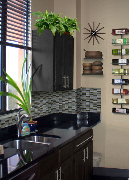
One easy option is to simply paint the upper cabinets black to match the lower. The walls are painted a nice shade of “paper bag” called Gobi Desert from Behr. Then add some interest with a tiled backsplash from Modwalls in Metropol. In the kitchen, the best decor accessories are often functional. Wine bottles can make pretty wall art with this mounted rack and wooden bowls become kitchen sculpture with open shelves. And of course, a few plants and a retro clock finish it off.
Option 1
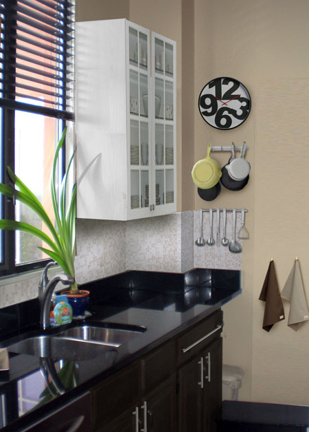
For a fresher look, how about some white cabinets? There’s no rule saying that upper cabinets and lower cabinets have to match. Here, some extra-tall white cabinets with glass doors are functional and a focal point. I kept it fresh with a white backsplash and a fun graphic wall clock. And of course, try using your prettiest pots and tea towels as wall accessories you can use.
Option 2
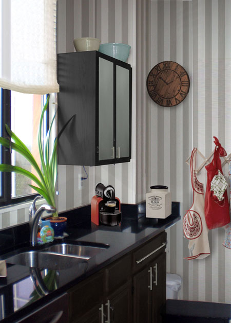
Lastly for something a little different, here’s a kitchen wallpaper scheme in a classic stripe from Farrow and Ball. Because there is so little wall space, it’s easy to add wallpaper. Plus, it’s not too overwhelming and not too expensive. Again, the cabinets are black, but a frosted glass door keeps it modern. I also added a roman shade from the Shade Store to lighten up the room. Lastly, a few accessories like this rustic wall clock and gorgeous espresso maker make this kitchen feel like home.
Option 3
Now it’s your turn to weigh in!
[polldaddy poll=5148052]


8 responses to “A Small Kitchen Gets Big Style”
Wow – exactly what I needed. Which do YOU like best? I need opinions! PS, although that shade is Gobi Desert, I had it made up in a low-VOC Benjamin Moore version that is heavenly, then did the living room in it. So, if paint, whole kitchen or just accent wall? Thanks for your help with this!
I think that solid white cabinets on top, black on bottom, would look best in this kitchen. It is not a large space, so the white cabinets would make it appear bigger. I have never been a fan of glass front cabinets, because then you have to keep them orderly!!!!
I do think that frosted glass is a nice option because it adds depth, but you don’t actually have to keep your dishes neat.
I like option 2 with frosted doors.
My favorite option is the first option. Very clean lines and well balanced. It’s very classy! Go for it avid reader! 😉
Very Useful Information and very inspiring. Thanks for sharing the articles.
I think the blk cab and adding the tile kicked it! what one did you do!! love me
So Magnificent I live very much of White Cabinet