Most people don’t get too excited about styling a common hallway, but we at Mochi Home were thrilled to get this reader submission. Living in the city, hallways are a big part of our interior life in condo and apartment buildings. Where many people have driveways and manicured front lawns, we have lobbies and hallways to welcome us (and our guests) home. Think of it as indoor curb appeal
This reader send a photo of their hallway, soon to be upgraded by vote of the condo association. Let’s see if we can help them choose a new look. My favorite places for hallway inspiration are hotels, of course! Hotels spend significant design effort in their hallways and lobbies and are great source of ideas.
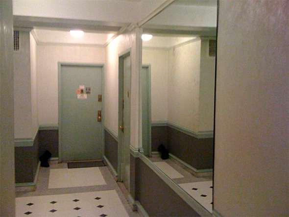
Here is the current hallway.

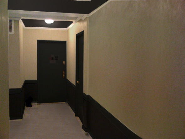
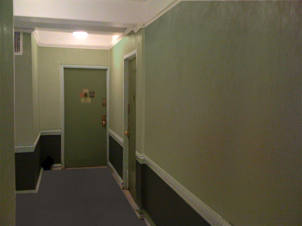
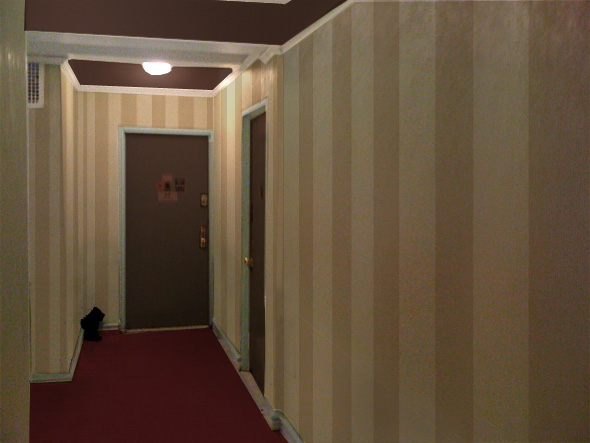
The main design changes in all of these options are to (1) remove the outdated mirror and (2) remove the pattern on the floor. After that, the bones of the hallways are pretty normal and standard and can easily look great with a fresh color scheme. This first transformation is the “drama” hallways. Note the black ceilings. This is inspired by a hotel hallway image.
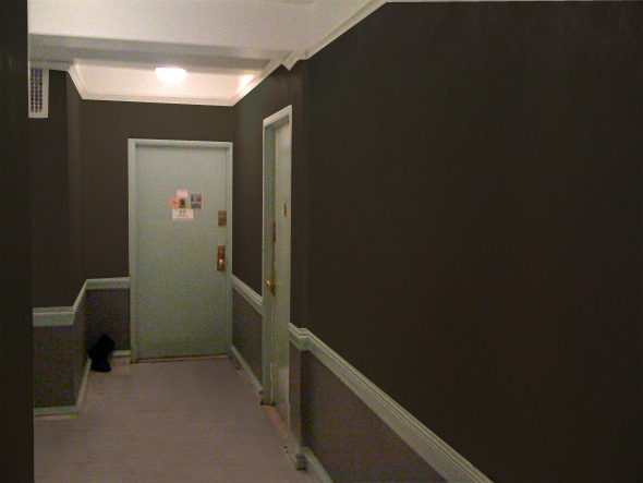
I like the existing chair rail and molding elements. I even don’t mind the current minty green of the doors and frames. You can easily give the hall a grown-up look by darkening the walls with a very mellow dark green-gray. Note the pattern is removed from the floor, helping to de-clutter the visuals.
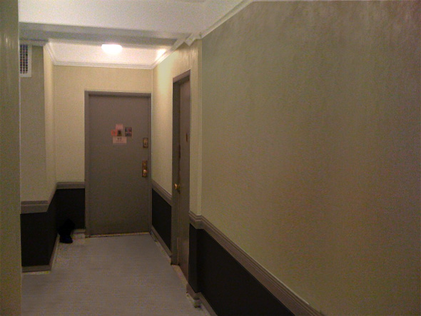
Neutrals are always a safe bet and won’t look dated over time. Here is a nice black/beige/tan mix. I could see this scheme in reality tomorrow!
If you don’t like neutrals, try a color. I would keep the colors muted and stick to a monochromatic effects to keep the hall from looking clowny. Here is a friendly green palette.

Lastly, you can also remove the chair rail detail and opt for a more streamlined wall. This is the total hotel hallway effect with tasteful striped walls and a punch of dark red on the floor.
Here a few more inspiring hallways for more ideas:


2 responses to “Giving an Old Hallway a New Year’s Facelift”
When searching for ideas for a similar project I came across your website blog. And by similar I mean both refreshing an old tenement hallway(s), trying to get the majority of coop shareholders to agree on a color scheme in hallway that has existing (yuk) tile on walls and floor. We’ll be replacing the lighting too.
May I send you pix like about to get your input & ideas?
You’ve written something that not only informs, but also inspires a sense of wonder and possibility.