When it comes to sizing artwork, I often prefer the “go big or go home” theory. It’s the easiest way to get loads of impact and minimizes installation issues if you use one large piece alone.
But sometimes, tiny artwork can be just as great. The negative space around the small pieces become as important as the artwork. Plus, tiny art invites you to walk right up to the wall and experience it in close range. It’s a whole other experience.
Which do you prefer? Check out this roundup with images from Houzz and see what strikes you most.
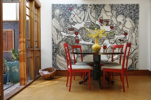
Extra-Large Artwork
One large, one small. This is a great comparison of full wall art versus art with white space. Gorgeous!
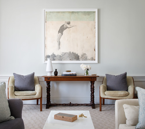
Large, but light – keeps it from being too overwhelming.
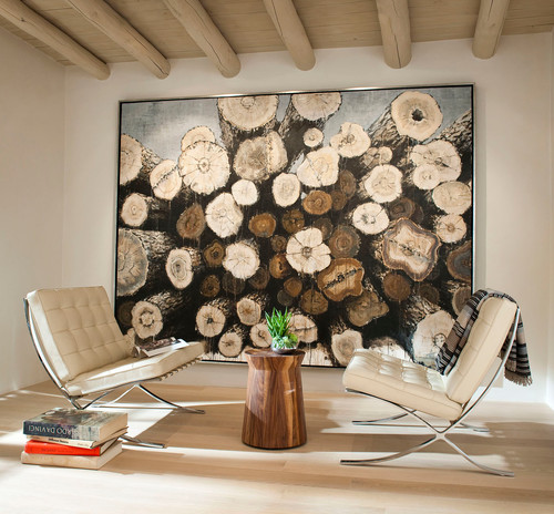
This art almost reads like wallpaper. The extra drama comes from taking the piece from floor to ceiling.
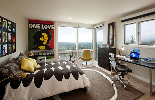
A big graphic poster blow-up is a real eye catcher for any age.
Tiny Artwork
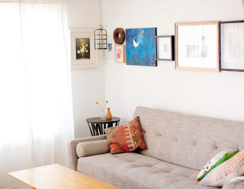
This little art is clumped together for bigger impact, but still invites you come take a closer look.
[ois skin=”Basic Blogpost Inline”]
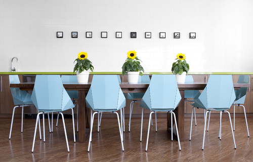
It’s all about the white space!
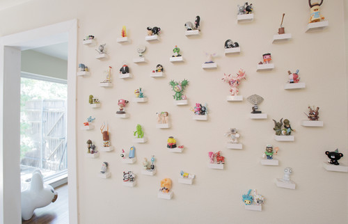
Who says wall art has to be 2-dimensional? I love how the individual pieces make a larger pattern on the wall.
The real artwork in this room is that fantastic view. But the tiny little pictures in between lure you over to the windows for further exploration. Love it!
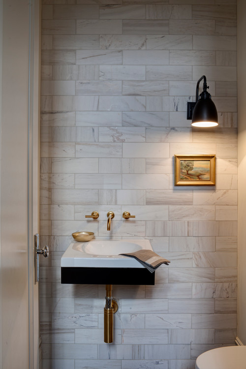
This is just the sweetest picture and makes an intimate little art moment in the powder room.
What’s your favorite, tiny or gigantic?



3 responses to “Houzz Roundup: Gigantic vs. Tiny Wall Art”
my favorite is both of tiny & gigantic
[…] (Image Source) (Art Options 1,2,3) […]
[…] Mochihome […]