Skip to content
Mochi Home
Where style meets real life.
Home
News
About
Contact
Twitter
Facebook
Instagram
Tag:
wallpaper
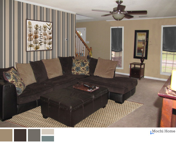
Living Room
3 Easy Steps to Ditch the Boring Brown
July 25, 2012
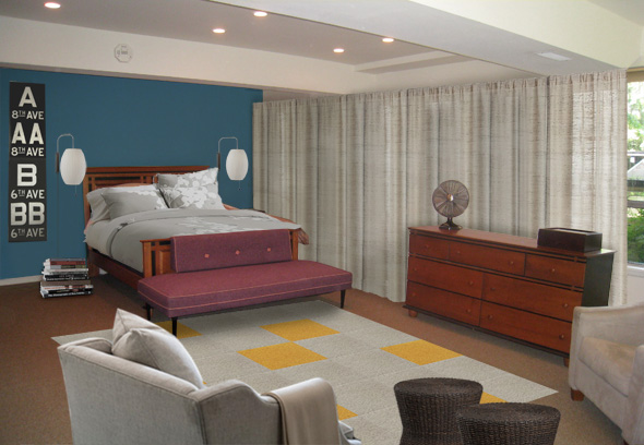
Bedroom
A Mid-Century Modern Bedroom Update
September 13, 2011
Living Room
A Room to Live In, a Couple, and a Bunny Named Todd
March 12, 2011
Living Room
Transforming a Room from Dark to Light
May 10, 2010
Living Room
Putting the “Great” in a Basic Brown Great Room
February 21, 2010
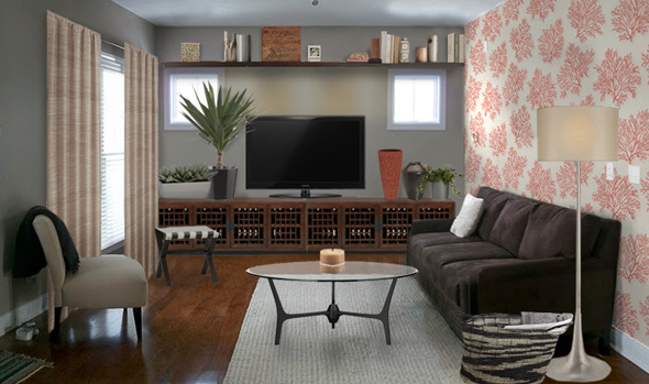
General
,
Living Room
Finding Inspiration: Fox Hill B&B
August 19, 2009
1
2
Next Page
→