Skip to content
Mochi Home
Where style meets real life.
Home
News
About
Contact
Twitter
Facebook
Instagram
Tag:
blue
Inspiration
,
Other Rooms
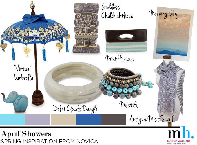
Midweek Mood Board: April Showers
April 2, 2014
General
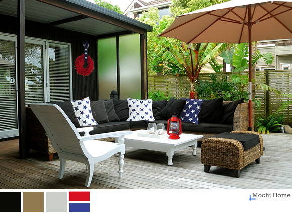
Hooray for the Independent Spirit
July 4, 2013
Living Room
Color Study: Sage Green Living Room
February 3, 2013
Living Room
3 Easy Steps to Ditch the Boring Brown
July 25, 2012
Other Rooms
Modern Americana from Etsy
July 3, 2012
Bedroom
Red Hot and Boyishly Handsome (Part 1)
June 30, 2012
1
2
3
…
7
Next Page
→