Skip to content
Mochi Home
Where style meets real life.
Home
News
About
Contact
Twitter
Facebook
Instagram
Tag:
accessories
General
,
Inspiration
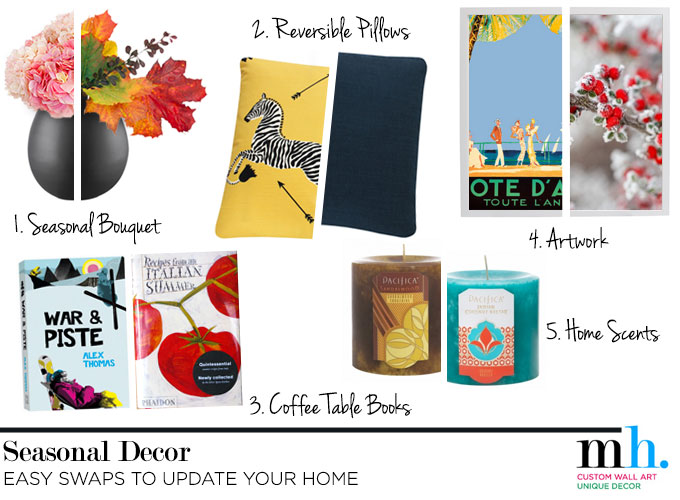
5 Ways I Change My Decor for the Season
September 3, 2014
Inspiration
,
Other Rooms
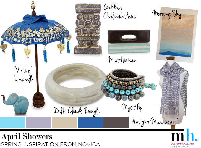
Midweek Mood Board: April Showers
April 2, 2014
Custom Wall Art
Pretty Little Photo Canvas Makeover
July 26, 2013
General
,
Tips & Tricks
Your Wall Art is the Wrong Size
July 17, 2013
DIY
,
General
Make Your Home a Party Place
January 14, 2013
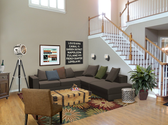
Living Room
Living Large in Atlanta
September 6, 2012
1
2
3
…
5
Next Page
→