Skip to content
Mochi Home
Where style meets real life.
Home
News
About
Contact
Twitter
Facebook
Instagram
Category:
Bedroom
Bedroom
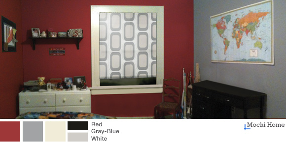
Red Hot and Boyishly Handsome (Part 1)
June 30, 2012
Bedroom
,
General
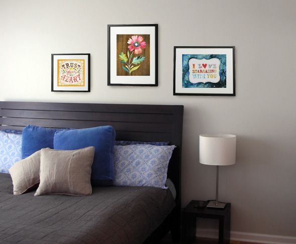
Etsy Find: Sweet Little Paintings in Happy Colors
June 1, 2012
Bedroom
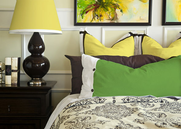
Color Blocking in Monet’s Garden
May 31, 2012
Bedroom
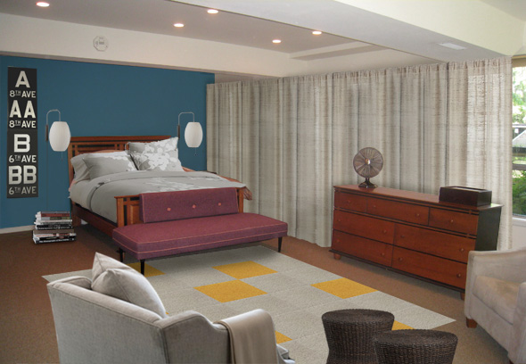
A Mid-Century Modern Bedroom Update
September 13, 2011
Bedroom
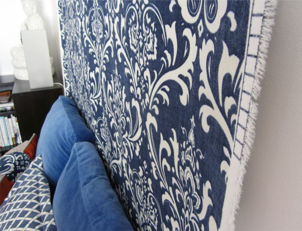
Make a Headboard (and a Statement!) with Fabric
June 17, 2011
Bedroom
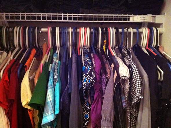
Mochi Quickie: What a Difference a Hanger Makes
May 14, 2011
1
2
3
Next Page
→